Pazzo! Earns Dining Award for Best Restaurant Makeover
January 18, 2021
Legendary Italian restaurant on Fifth Avenue South $1.0 million remodel coincides with 25th anniversary celebration
 Naples, FL: (January 19, 2021) . . . Culinary Concepts’ all-star reputation for culinary excellence continues to grow with the recent announcement Pazzo! Cucina Italiana, the Southwest Florida restaurant group’s legendary Italian restaurant on Fifth Avenue South in Naples, earned the best restaurant makeover from luxury lifestyle Naples Illustrated magazine’s 8th Annual Dining Awards.
Editors noted “in the midst of economic challenges presented because of covid-19, restaurants reinvented themselves” when selecting Pazzo’s $1.0 million remodel — featuring a unique and creative interpretation of Italian style – for the prestigious honor.
“I wanted the Pazzo (crazy in Italian) concept to match the spirit of the place,” says chef Skip Quillen, founder and owner of Culinary Concepts restaurant group comprised of Pazzo!, Chops City Grill and Yabba Island Grill on Fifth Avenue South in Naples, Chops City Grill in Bonita Springs and The Saloon in Estero. “We created an atmosphere that is playful, exciting and fun and timed it to coincide with our 25th anniversary.”
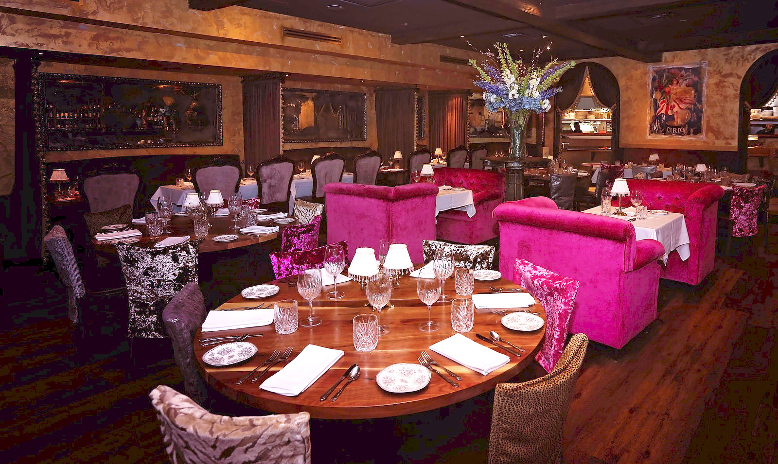
The new Pazzo new décor is layered in luxury – from floor to ceiling – not a corner missed. Every detail is top quality and fine craftsmanship. It’s a classic timeless elegance that will be enjoyed for years using textures and contrasts.
Wood tones give the interior a weathered look with sumptuous draperies to make it feel even more comfy. Inviting lighting and occasional bursts of color temper the intricate dark interior composed mostly of wood, silvers, golds and lavender. The muted color scheme is used to imitate natural colors. The brighter colors are articulated through the trimmings, embellishments and accents, while the softer colors are incorporated in the walls, draperies and ceilings.
The warm-toned wooden floor essential for a rustic décor that contrasts with the elegant white tablecloths. Its white ceiling was replaced with exposed wood beams to create a more upscale feeling and making the room feel and look bigger and modern by adding a lot of detail in every direction. A copper coffered ceiling was fitted above the bar made up of squared tiles surrounded by a grid pattern of beam
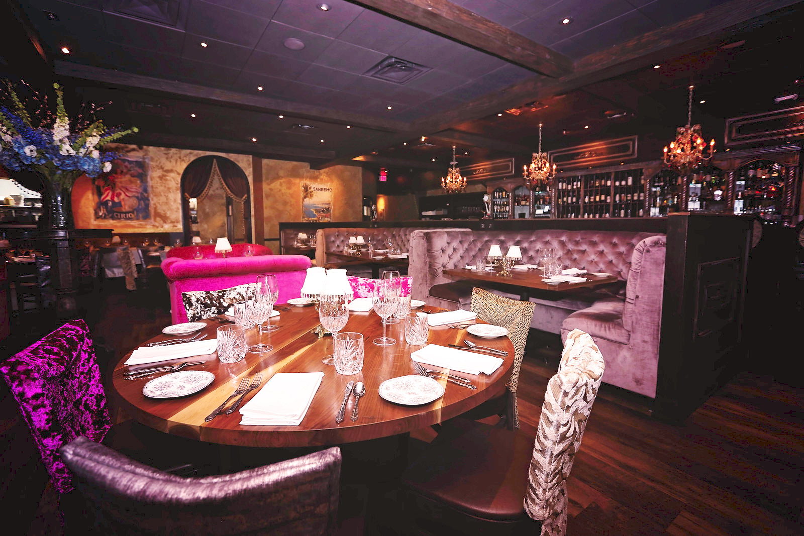
Pazzo’s interior lighting was modernized by installing three new chandeliers, draped in glass crystals, dangling over the impressive 20-foot long wooden bar. Sculptural chandeliers are often used as a centerpiece in Italian interiors, these chandeliers are “jewelry for the bar,” with delicate glass grape and peach fruit adornments that artfully relate to food in a subtle way. Nearby four mini pink crystal chandeliers are hung above selected tables in the anterior dining room, and while not as dramatic, they are an impactful part of the interior lighting design.
Several of the original lighting accessories including six antique glass sconces remain. These ornate wall fixtures were repurposed to create dramatic light and shadows in the narrow hallway that connects the main dining room and bar with the rear parking lot and curbside meal pick-up area.
Interior walls were finished in several thin layers of textured plaster by Naples faux and abstract artist Shiree Nichole, using a hand trowel over existing plaster with additional sound proofing plaster. Plaster was chosen because it is one of the most versatile and decorative surface treatments. Walls were further enriched by highlighting in numerous coatings of metallic gold paint with a touch of green. The overall impact of the plaster is chic as well as rustic and gives an elusive depth and texture.
Nichole’s mural painting technique – a type of fresco application — is evident on several of the dining room walls decorated with a distinctive collection of 15 vintage Italian posters some by illustrator Leonetto Cappiello (1875-1942) representing Italian labels like Campari aperitif, Cirio tomatoes, and Strega liqueur. The posters were applied to the wall with clearcoat applied directly onto wet plaster so that the paint becomes an integral part of the plaster. Developed in Italy, fresco was a popular technique in the 13th century and perfected during the Renaissance.
Six large reflective wall mirrors, used to define the secluded banquettes in the dining room, were distressed and frames embellished to create a romantic antique look.
To enhance the overall ambiance of the restaurant’s interior, new draperies were custom made in an espresso brown chenille fabric manufactured by Ado in Germany and trimmed with a handmade 4.5-inch Venetian tassel fringe. The sophisticated taupe and gold pom-pom fringe trim, decorated with gold glass beads, gold brass elements and ornate wrapped bobbins, is also used as opulent curtain tiebacks. These tassel tiebacks create a soft curve on each side of drapery panels framing the arched doorways and spaces between the private dining banquettes.
Four oversized fuchsia-colored chairs are the real seating centerpiece, adding a playful pop of color. Wooden chairs were repainted and reupholstered in a new crushed velvet fabric by JF Fabrics chosen for its sumptuous feeling and graceful silkiness. Velvets are on target because they are very soft to the touch, stay cool in the warm weather and are also very durable with high UV resistance, high abrasion and pill resistance.
The warm dark chairs stand out and make a bold statement with a mix of 14 different patterned velvet chair backs, each with its own personality, including bright pinks, multi-colored stripes, taupes, browns, plus leopard, tiger, and cheetah animal prints. The chair backs’ smoothness makes a significant contrast against the various textured surfaces like the walls and floors. The addition of the many colors also gives the dining room more depth.
Wood tones were changed to give all the woodwork more dimension with undertones so that when you look at it, it’s not just a flat brown but several layers of darker rich deep browns. This design technique makes the overall impact of the interior welcoming and luxuriant.
Vertical wood panels along the bar, the half wall separating the dining room from the bar area, and the entry bookcase were embellished with new wood trims and applied appliqués in the corners. This was done to add dimension to the border treatment and harmonize with the wood details of the bar.
“The hand-carved scroll appliqués instantly add elegance,” explains interior designer Theresa Gillan. “The appliques’ scroll shapes with feathered details and round terminuses were further enhanced and exquisitely hand painted in gold and silver metallic paints with lavender tones,” she adds, noting how the one-of-a-kind appliqués turn a simple piece of wood into a gorgeous, personalized decorative show piece.
Old World Italian style may sometimes seem over the top to those who prefer a more minimalist approach, but the supreme elegance of Italian style cannot be ignored. The use of high-quality materials in the design adds a little unexpected glamorous touch – a bit of pazzo — that will never go out of style!

